iCharts
I’ve had a little bit of trouble finding statistical data to interpret and put into a chart, because my topic isn’t really recorded in numbers. It’s especially hard to find data from the time period that involved LGBT people, since the government was trying not to draw attention tot he movement, or to the existence of such people. However, I did find a dataset that had recorded the percentages of self identified LGBT by state. People were surveyed in each state, and asked how they identified their sexual orientation. The data then shows what percentage of the total state population identifies as LGBT.
Through this research, you can clearly see that DC is the state (or district) that has the highest population of LGBT people, with a total of 10%. While this data is current, and not from the time period in which my research is directly focused on, it is still relevant to my topic because it shows the lasting impact of the movement in DC. Because District of Columbia is where the heart of the political side of the movement was born, this makes sense as to why the population is highest here. Clearly, the movement has accomplished something in present day places for LGBT people to feel safe and continue to reside.
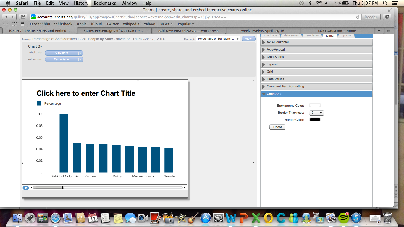
As you can see in the chart, DC has a 10% LGBT population. To see the full chart, you can go to this link: http://www.icharts.net/chartchannel/click-here-enter-chart-title_mhrryijbc
I’m going to continue searching for relevant data from the 1960s-1980s, when the movement was occurring, that might help to clarify my research question, but I thought that this was a decent start.
Filed under Final Project, Tools | Comment (0)
Speak your mind